Wednesday, December 30, 2009

Pastel- Silver Metamorphosis

I was writing up a supply list for pastels for a possible workshop and thought I'd do one since I had them out.
4x3 pastel on board

Tuesday, December 29, 2009

Silver Metamorphosis continues


I tried a darker yellow background which is another way of saying raw umber. I tried a new tube of Old Holland Raw Umber to see if it flowed better than Winsor Newton. Maybe a bit better. Since it takes so long to use a tube up I'll see how it acts in a few years!!
I bought some pears so I may do them to keep up with my yellow addiction at the moment. We'll see, never know til I sit down to paint.
4x3 inches, oil on board

Sunday, December 27, 2009

Silver Metamophosis

This might be my favorite so far. But then again many times the last painting i do is my fav.
Feel like I'm mining for gold as well as silver here!! I used a palette knife to get lots of paint in the background. I also smudged the whole thing (I think I talked about this in the book) after I did my block in and then put more paint on. Feel like I've pushed the brushstokes farther. Walking that line between getting too messy and not wanting to be too literal. Been looking at Stanley Bielen. funny how you can look at and want to "do it" like someone else but can only go so far. As long as I keep painting and enjoying that's all that matters.
"Silver Metamorphosis" 4x3 inches oil on board

Monday, December 21, 2009

Silver Metamorphosis


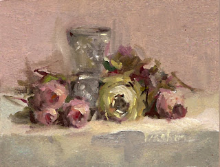
I am continuing my painting of the same set up always thinking I've got to do something different/better. Liking it a lot.
3x4 inches oil on board.

Sunday, December 20, 2009

Silver Metamorphosis

I became aware of the background in this one. Not to mean that I usually don't care about the background but I think that after doing these for the past couple of weeks I get to see more of how the background can be handled in almost an abstract manner as opposed to negative space that supports the positive shapes.

Thursday, December 17, 2009

Silver Metamorphosis continues


As a neighbor pointed out, this is getting very zen(ish). What if I could spend the rest of my life painting this setup? OMG! that would be phenomenal but I'm nowhere near that state.
Anywho, there are two more that I just varnished and waiting to dry before I scan them.
This has been a great trip; one painting leading to another. I changed the backgrounds and worked on brushstrokes. I just noticed that the backgrounds were getting abstracted and I could play with that more. I don't know if I've ever kept the background so close to the foreground color. I like it.
These are all 3x4 inches on archival board.

Friday, December 11, 2009

Silver Metamorphosis


My trusted Permelba White seemed much much drier than usual. I don't know if you have this experience but sometimes it comes out of the tube oilier or not so oily. I don't know how old this tube is (I'm sure I don't use it as much as most people since my paintings are so small and I would always prefer to use any other color besides white to change the value).
Anywho, I have a tube (old also) of Old Holland Light Yellow which is a really nice white with just a touch of yellow in it. I figured I'd use that until I get to Pearl Paint to get a tube of Permelba. (BTW, the shelves at Pearl were almost bare; what's up with that?) My plan was to either keep doing yellow/purple palette paintings or go out of my box and use it in one of the other palettes. As it turned out I have gotten smitten with yellows. Two of the four paintings are dry so I've posted these two. I was working on getting more subtle; instead of pink flowers do whitish/yellow ones. and gray down the background and the tabletop.
I've been dreaming brushstokes this week. Really nice. Love when that happens.
Also, was watching "The End of an Affair" with Julianne Moore and noticed that the sets all seem to be tones of yellow!!! OMG!! Our grandkids are coming for dinner tomorrow so I won't be able to paint until... Hope this feeling continues.

Saturday, November 28, 2009

All Together Now

3x4 inches, oil on board

Sunday, November 22, 2009

More Gray Paintings


One hard thing about my posts is that I have to wait for the paintings to dry before I can spray varnish them and then scan them and by that time I'm into something else and can barely remember (or really want to remember because I'm thinking about what I'm thinking about now) what my motivation was when I painted this last week. I'm sure it was basically working on getting a good gray color and feeling like it was ok to explore this. It has led me into thinking about something else which I guess I'll leave until I post new paintings. It always feels so good to let one painting lead you to the next.

Wednesday, November 18, 2009

Kristi Grusendorf's Painting


I'd like to start posting both my student's and reader's paintings and anything they have to say about them. So please email me jpegs of your paintings and I'll post 'em!!!
Kristi's website is kristigrussendorf.com
Kristi was in the Utah Watercolor Society workshop last month and she just sent this beauty.
Here's what she wrote:
Every year I do a Christmas still life. This year I did a red/green one with a bit of blue thrown in.
Since your workshop, all but one of the paintings I've done has been in the complementary pallettes (not the exact colors you use). I've always limited my colors so I suspect I've been doing it a bit already but your workshop has encouraged me to think in terms of the complements more often. Even though "size doesn't matter", this one is 10 x 12.
Kristi

Saturday, November 14, 2009

Gray Skies, Gray Painitings?


It's been rainy all week but the autumn colors look great against the gray skies. I didn't make the connection until this minute as I posted the paintings I worked on this week. It just felt right to do gray work!!
All paintings are oil on board; some are for floater frames and some for the regular type.

Tuesday, November 10, 2009

Floater frame

Please forgive the photography on this one. I repainted a painting. Something I've never done before but I thought I'd give it a try cause it was already in a floater frame and it is hard to get out and in again. I usually just toss them when they don't work. I'm going to try another one (or two) tomorrow on slightly larger boards that can be framed differently. Wish me luck!
"Red Tablecloth" 2 1/2" x 3 3/8" oil on board.

Monday, November 9, 2009


All of a sudden I've been struck by the idea of using gray backgrounds. I can't remember exactly how it happened. I think it was a combination of looking over the work in my studio and seeing Colleen Cox's. I mention this because it wasn't until seeing her work that I gave myself permission to go ahead and have this idea of doing a group of gray backgrounds. Why do we have to get permission? Isn't being an artist a good enough reason?
"Pink Creamer and Apples" 3x4 inches oil on board
"Pink Creamer and Apples" 2 1/2 x 3 3/8 oil on board

Thursday, November 5, 2009

Miniature Pastel

"Pink Creamer and Apples" 3x4 inches pastel on board

Wednesday, November 4, 2009

Two Handed


"Stillness IV and V" 3x4 inches oil on board

Tuesday, November 3, 2009

Duplicity


Doing two or more at a time is freeing in a lot of ways. If you mess up one you still have the other. I also like the idea of keeping one for myself.
"Two Pitchers, Two Onions" one is 3x4 and the other is 2 1/2 by 3 3/8 inches.

Monday, November 2, 2009

Daylight Savings Time Ends

I've always been totally dependent on sunny days to do my paintings. (It's so ingrained in me that when I see it's cloudy out I find it nearly impossible to get into the mood to paint- anyone else like that?) I use north light and a desk lamp that has warm and cool bulbs (which I usually use only the warm) to mix colors and do my paintings.
An epiphany struck just as Daylight Savings Time ended.
I woke up the other morning and had the idea to use a 500 watt bulb when its dark or cloudy.
I was concerned that the colors wouldn't be the same. I've been pleasantly surprised that this is working out especially since the days are so short this time of year and it seems we are getting so much rain. This is just great. It expands my working schedule tremendously. I just have to be careful about not leaving the bulb on for too long or go away and forget about it!! I've read about people using all different kinds of lighting but it never seemed to work for me.
I aim the lamp at the ceiling and still use two desk lights. Another thing that's great is that I didn't have to buy anything. Just used what was in the closet. This bulb really lights up the room. My husband suggested a 250 watt bulb. I guess I'll try that after I've burnt out all the 500's that I have!
"Blue Vase and Orange Slice" 3x4 inches.

Saturday, October 24, 2009

Marjorie's Response

I was asking "How
can I be as good as you?" and "What do I need to do?"
I have made hard copies of all sent by you and Kristi so I can read and
reread. Thank you, Joyce, for your reply to the
question. It is great. The perfect answer for me. Just what I needed to
hear and to think about.
The book list is also very helpful. I will see if I can find them. I have
The Art Spirit and B. Edwards books.
About the workshop. I want you to know that I have taken many workshops and
this one seemed to be just for me.
It was like, all in a nutshell. Everything seemed to come together. It's
all there, in one tiny painting-- everything
to make a great piece of art. I came home with confidence that I can do
this. Thank you for a great week.
Went to your website and looked at your work to help me finish some I had
started. Thanks for including photos in
the emails. I was going to ask for them.
I know this is a long reply, but one last thing. I was impressed with your
knowledge, wisdom, and willingness to share.
Also, I felt of your goodness and enjoyed being in your presence.
Thanks again for everything.

Friday, October 23, 2009

Utah Watercolor Society

I was in the beautiful state of Utah this month; invited by the Utah Watercolor Society! A great group of people who I hope to stay in touch with.
Something happened during the week which I thought I'd post since I know it is so central to all of us who are creative.
One of the women asked me,
“Why do people buy your paintings?” At first I was at a loss but after pondering about it for a few days I thought what she was really asking was, “What makes you a good artist?” or “What do I need to do to be a good artist?”
I know that one of the reasons she was taking the class was “to loosen up”. She became conflicted when her brother-in-law criticized her by telling her she was “moving backwards”.
As artists we all face criticism from our family, friends and most of all from ourselves. If we take the time we would see that all artists from the beginning of time had to face crits from someone. Making art is something we have to do to please ourselves and not worry about what anyone else thinks.
Easier said than done.
I’ve found that making art requires discipline, sacrifice and self-confidence. I gave up a 20 year career to take classes full time. I changed my life style. I painted small when everyone else was painting big. I pushed through self-doubts. I painted almost everyday.
I got help where I could. I hung out with only those people who were supportive. I read about art and different artists struggles.
My story will not be your story.
What makes art interesting is that everyone has their own story and style.
All I can say is learn is much as you can, spend as much time at it as possible and stay true to yourself.

Thursday, October 22, 2009

Rising SunWorkshop


This was a great 2 day oil workshop in Rising Sun Indiana that took place over the summer. Yikes. I'm just posting it now. I think I came home and got into the pool and thinking about my next workshop which was going to be a watercolor workshop in Utah. Oh yeah, and I got so involved with the DVDs. That was totally engrossing. Hope I'll be back on track now that I don't have any major projects ahead of me. Maybe I can just paint!!

Thursday, October 1, 2009

Onions And Green Grapes


I always find it fun to do the same setup in two or more of my palettes. The one on top is yellow/purple and the one on bottom is orange/blue.
I really should be packing for our Utah trip but this is too much fun to stop!
Here is a small clip of a 60 minute DVD entitled "Bubble Glass and Onion". It's $35 and includes shipping in the U.S. I do 95% of my watercolors on RTsTx boards. Really like them! I will be bringing them to the workshop.


Sunday, September 27, 2009

White Pitcher and Yellow Cup


Sorry for the lack of posting in the last few weeks (almost months?). I've been totally engrossed in producing my own oil and watercolor videos. I've sent them out to some venues for review and then may have to work on jacket covers?... Anyway I'm happy to get back to some painting. I will be leaving for Salt Lake City for a watercolor workshop and then some touring of the National Parks. Very exciting.
Most of the time I get to feeling like I won't remember how to paint just before I have to give a workshop. Just a case of pre-performing jitters. Now I can think I've got the video so at least some people will know that I really can do this stuff. It's great because so much is on the video and I usually forget to say all that when I'm trying to do a good painting. Then again stuff happens in a workshop that won't happen on a video. Anyway I'm blessed to be able to share with so many wonderful people. It's all good.

Friday, September 11, 2009

Accidental Deletion

OMG! I accidentally deleted my link to your blog! Please send me your address and I repost it!!

Friday, July 24, 2009

NEW OIL DEMO DVD

I've produced my own demo!! This 60 minute still life video accompanies my book BIG ART, small canvas.
It's $35 including shipping in the continental US. For those of you outside US please contact me.
for additional shipping charges.
I can send you a paypal invoice or you can pay with a check.


Monday, July 20, 2009

Bubble Glass and Onion


Pastel, 3x4 inches, POR

Sunday, July 19, 2009

Preparing for oil video


"Roses" 3x4 inches, oil on board, POR

Sunday, July 12, 2009

Working on video


I painted this on video. Still working on the tech stuff. Learning a lot about imovie. I didn't do the sound yet. and still figuring out how much to compress it before I burn it to a disc. Anyone know about this?

Friday, July 10, 2009

My Cup Runneth Over


I'm liking doing pencil pastels. Fits the summer; no dust indoors. Can even do it by the pool!

Monday, July 6, 2009

Tuesday, June 23, 2009

Brooklyn Museum Vase and Orange Slice


I used my orange/blue watercolor palette substituting French Ultramarine Blue for Cobalt just to see how I liked the colors. I was wondering if FUB would be more transparent than Cobalt. Anyone have any thoughts about that?

Thursday, June 11, 2009

Another pastel

Wednesday, June 10, 2009

Pastel


I've been thinking about doing pastels in my small size for quite awhile but it wasn't until I thought of pastel pencils that I felt I could give it a go. I find them quite enjoyable to do and it being summer I can do them outside on my terrace and be free of the dust!

Wednesday, June 3, 2009

Color Theory for Complementary Palette


I have an update for the three complementary palettes that I've been using. They are in my book on pages 27-29 of Big Art, Small Canvas. As some of you may know Daler Rowwney doesn't make Chrome Green anymore. Or rather they have renamed it Yellow-Green. I also substituted a couple of colors since another palette color was close enough. Some colors are not sustitutable but to make purchasing easier I looked for ways to reduce the number of colors needed. Also, using Winsor Violet Dioxazine is much less expensive than Bright Violet by Old Holland.


There is a reason for each color used for each of the three palettes.
There is a true color, a warm version of the true color, a cool version of the true color, a light neutral version of the true color and a dark neutral version of the true color.
I also included a favorite color for a certain reasons (which I will explain in the palette.

In the ORANGE/BLUE palette:
For the oranges: Cadmium Orange is the true color
Chrome Yellow hue is the cool color
Cadmium Red deep hue is the warm color
Naples Yellow is the light neutral
Mars Violet Deep is the dark neutral color
For the blues: Cobalt Blue is the true color
Winsor Blue hue is the cool color
Mauve (blue shade) is the warm color
Violet Grey is the light neutral
Indigo is the dark neutral color
Blue Black is the darkest cool

In the RED/GREEN palette:
For the reds: Cadmium Red Deep Hue is the true color
Permanent Rose is the cool color
Cadmium Orange is the warm color
Indian Red is the light neutral
Purple Madder is the dark neutral color
For the greens: Permanent Green Light is the true color
Winsor Green is the cool color
Sap Green is the warm color
Yellow-Green is the light neutral
Raw Umber is the dark neutral color
Permanent Green Deep is used for making black

In the YELLOW/PURPLE palette:
For the yellows: Chrome Yellow Hue is the true color
Yellow-Green is the cool color
Cadmium Yellow Deep is the warm color
Naples Yellow is the light neutral
Raw Umber is the dark neutral color
For the purples: Bright Violet (or Winsor Violet Dioxazine) is the true color
Ultramarine Violet(or Mauve Blue Shade) is the cool color
Permanent Rose is the warm color
Violet Grey is the light neutral
Mars Violet Deep is the dark neutral color
Purple Madder is a favorite and used as a dark warm
Blue Black is the coolest dark

Monday, June 1, 2009

Bonita Springs demo

Here is one of the demos from the workshop. Next workshop is in August in a small town near Cincinnati and it's only $75 for two days. Probably near full. Check my website for details!

Saturday, May 30, 2009

Cloud Series


These are watercolors done with more white gouache than I usually use but I went with it. They are 3x4 inches . I worked on them last week in order to meet a deadline for a MTA submission.
Wish me luck! One good thing about deadlines and submissions is that you get some work done!